Onboarding made simple.
The perfect onboarding.
From drop-offs to an informed process with increased sign-ups.
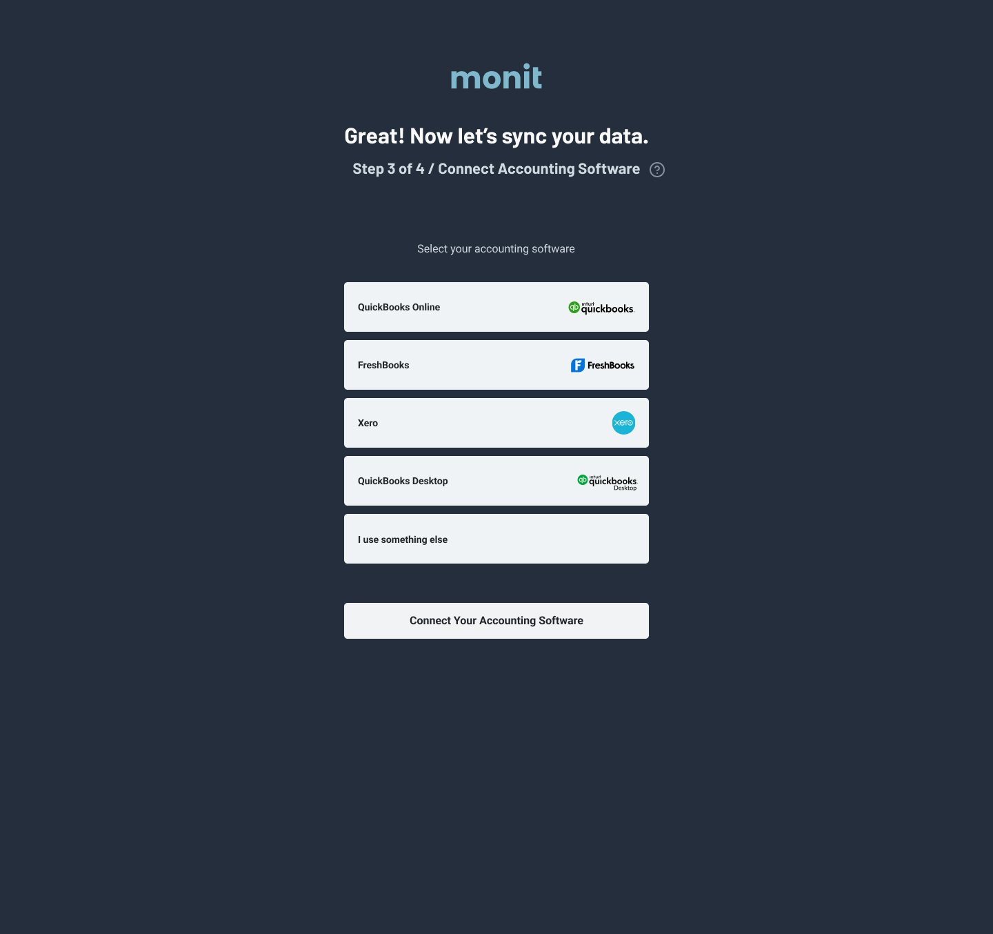
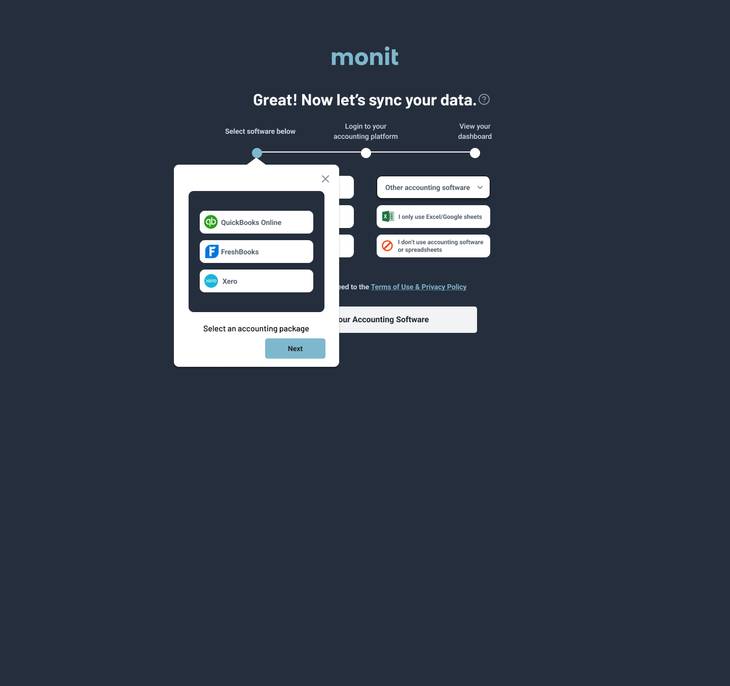
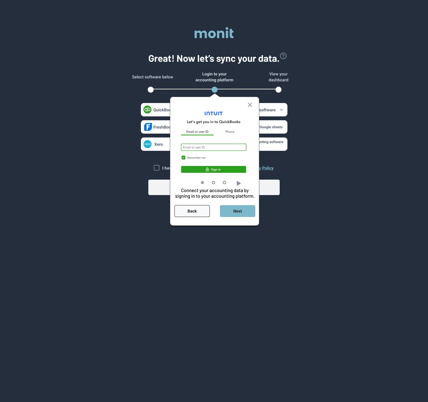
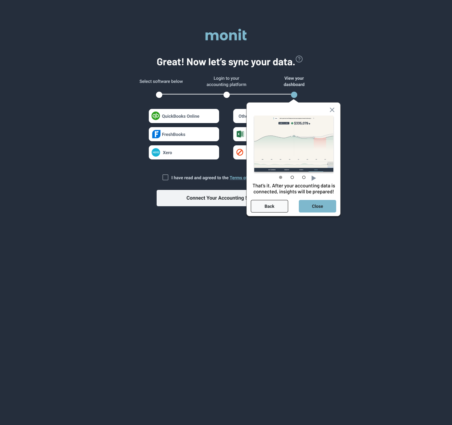
Original onboarding accounting selection
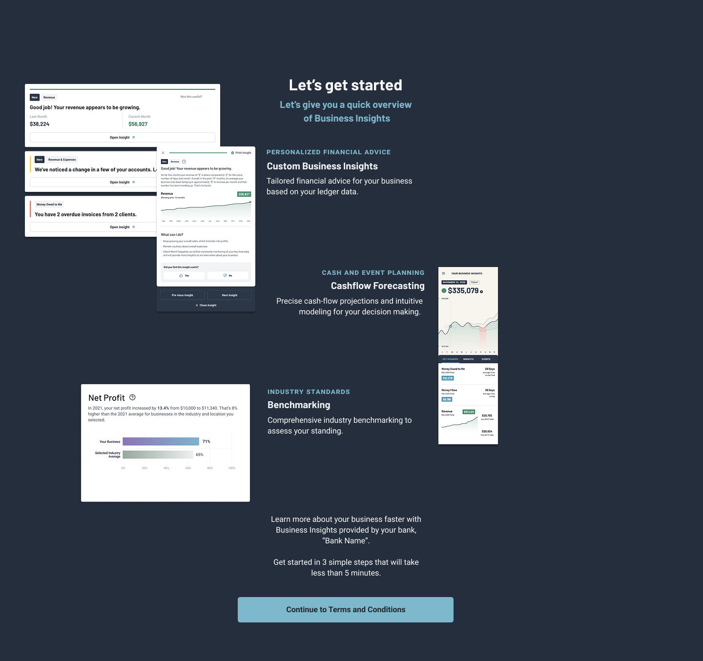
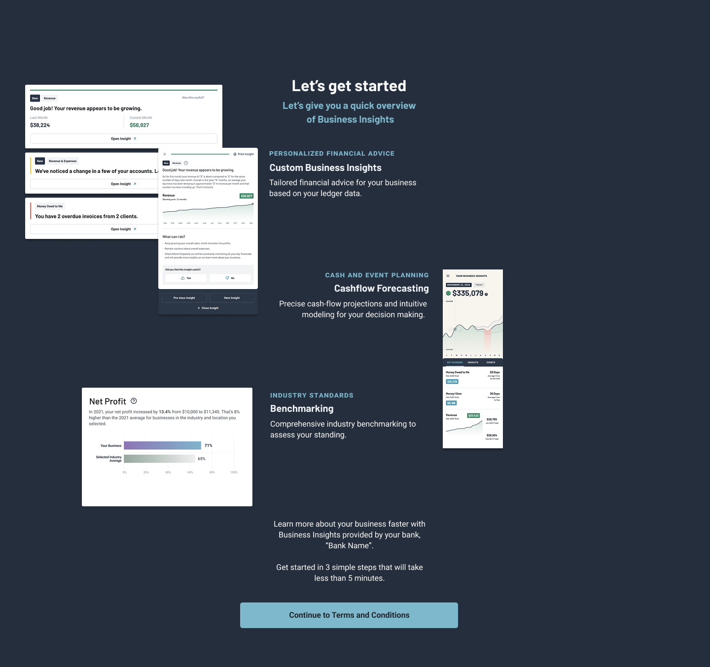
Splash Page - Made customizable for each financial institution.
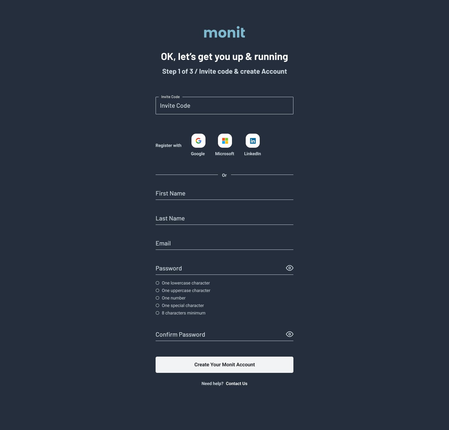
Original account creation
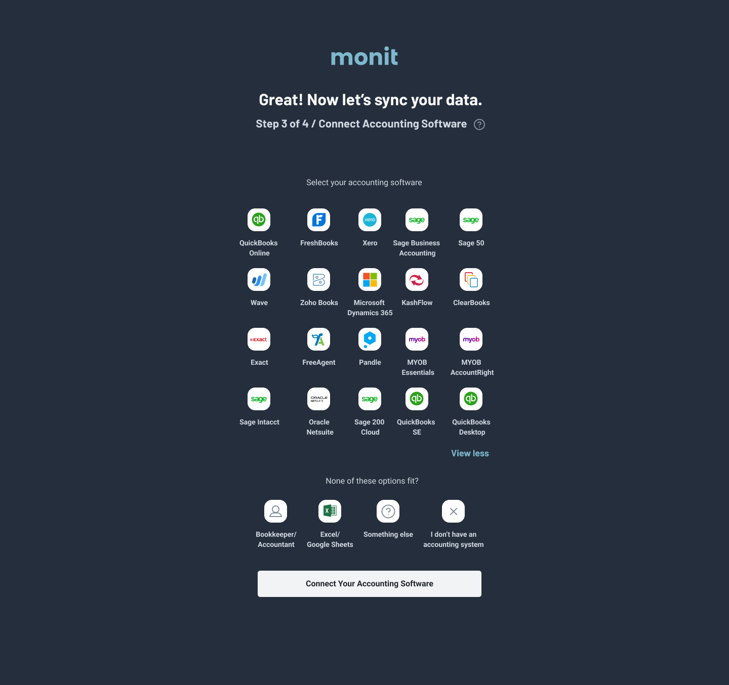
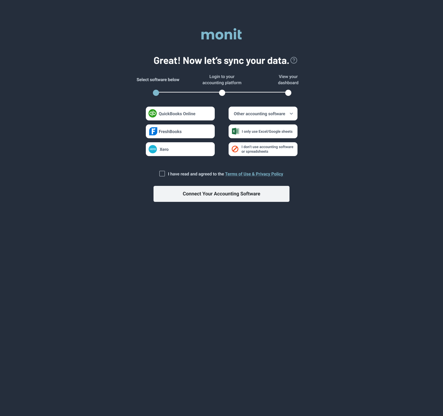
Accounting selection iteration
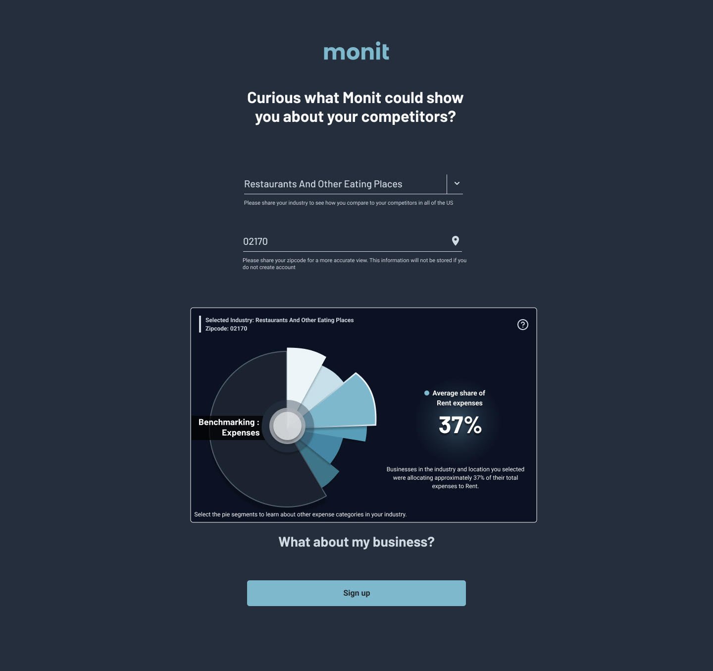
Benchmarking as a hook
Products used: Figma, Feedback Loop/Disqo, Monit SMB Portal
Problem
Monit’s small business platform was experiencing significant user drop-off during onboarding, resulting in low adoption and activation rates. The core challenge centered around trust, clarity, and perceived value within the sign-up experience.
In order to access the platform’s financial insights tools, small business owners were required to connect sensitive accounting and banking data—information that was often held separately from their financial institution. Many users did not fully understand why this data was being requested, how it would be used, or what value they would receive in return.
The platform itself was designed to transform raw financial data into actionable business insights, enabling banks to better understand the financial health of their small business clients and offer more relevant financial products such as lending solutions, credit offerings, and other banking services.
However, the onboarding experience failed to clearly communicate this value exchange, leading to hesitation, confusion, and abandonment before account completion.
Educating & Informing Users
Through onboarding analytics and session recordings, we identified a major drop-off point: users were abandoning the process after entering their email but before connecting their accounting platform. We also observed friction around questions that didn’t feel immediately relevant—particularly asking users to select their industry—which resulted in dead clicks, hesitation, and increased abandonment.
To better understand these behaviors, we expanded our research through Feedback Loop surveys and interviews with small-to-medium business owners. The findings revealed several consistent themes:
Users didn’t clearly understand the value of the platform before being asked to connect sensitive financial data.
The onboarding flow lacked transparency around how long the process would take.
Users were hesitant to provide information they perceived as unnecessary during sign-up.
Some businesses didn’t see their accounting platform represented, creating uncertainty and distrust early in the experience.
Solving the Value & Trust Gap
Our first priority was addressing the value communication problem. Because Monit was distributed through banking partners, many users entered onboarding directly from their bank’s platform without any prior explanation of what Monit was or why it mattered.
To solve this, I introduced a pre-onboarding splash page that educated users before any account creation began. The page clearly communicated:
What Monit does
How financial data would be used
The benefits users would receive from connecting their accounts
How the platform could support their business over time
This created a more informed and confident user before entering onboarding.
We also explored more personalized approaches to engagement. One early concept asked users optional questions about industry and employee count, then surfaced benchmarking visuals comparing similar businesses and spending trends. While the initial onboarding implementation created too much friction, the concept later evolved into a successful “Benchmarking as a Hook” widget integrated with our digital banking partner, Q2.
Simplifying the Onboarding Experience
The next focus was reducing perceived effort and cognitive load.
We redesigned onboarding to make the process more transparent by introducing a visual progress system that outlined each onboarding step upfront. Users could clearly understand:
How many steps remained
What information would be required
Where they were in the process
We also streamlined account creation through SSO integrations within partner banking platforms. By removing redundant fields like business name, first name, and last name, we significantly reduced onboarding friction.
Most importantly, we removed the industry selection step entirely from onboarding after identifying it as a major abandonment point through session recordings. Since the data was primarily tied to benchmarking features and not core functionality, we deferred collecting it until after activation—allowing users to engage with the product first before requesting additional information.
Iteration & Refinement
The solution evolved through multiple iterations. Early versions attempted to solve too many problems simultaneously, including collecting detailed accounting platform preferences during onboarding. Initial concepts displayed accounting integrations in large visual grids, but testing revealed the experience became cluttered and overwhelming.
We ultimately simplified the experience by prioritizing the most commonly used accounting platforms while moving less common options into secondary dropdown selections. We also ensured users without digital accounting systems could still proceed through onboarding without friction.
The result was a more focused, transparent, and user-centered onboarding experience designed around education, trust, and reduced cognitive load rather than aggressive data collection upfront.
Testing & Validation
Testing and feedback were integrated throughout every stage of the redesign process. Rather than relying solely on internal assumptions, we continuously validated onboarding concepts with both end users and banking stakeholders to ensure the experience addressed real concerns from multiple perspectives.
Using the research platform Feedback Loop, we conducted surveys and concept testing sessions with small-to-medium business owners—the core users of the platform. These sessions allowed us to evaluate onboarding flows, messaging clarity, perceived trust, and feature comprehension before implementation. We tested multiple variations of onboarding structure, value propositions, progress indicators, and data collection methods to better understand where hesitation and confusion occurred.
In addition to quantitative survey responses, session recordings and behavioral observations helped identify moments of friction such as dead clicks, abandonment points, and uncertainty around sensitive financial data connections. These findings directly informed iterative design decisions throughout the project.
We also regularly presented onboarding concepts and prototypes to representatives from our banking partners. Because Monit was distributed through financial institutions, their feedback was critical in understanding how the product aligned with customer expectations, banking workflows, and trust considerations from the institution’s perspective. These conversations helped refine both the educational messaging and the handoff experience between banking platforms and Monit’s onboarding flow.
This iterative testing process ensured that decisions were grounded in actual user behavior and stakeholder feedback rather than assumptions, allowing the onboarding experience to evolve into something clearer, more trustworthy, and more effective for adoption.